Die Wahl der Kinderzimmerfarben kann überwältigend sein, wenn man bedenkt, wie sehr sie die emotionale Entwicklung eines Babys prägen. Wissenschaftler haben herausgefunden, dass sanfte Pastelltöne und von der Natur inspirierte Farbtöne Ängste abbauen und Kindern helfen können, sich sicherer zu fühlen . Die meisten frischgebackenen Eltern konzentrieren sich auf niedliche Trends oder Geschlechterstereotype, aber die kraftvollsten Farben sind diejenigen, die von Anfang an Ruhe, Kreativität und Geborgenheit fördern.
Inhaltsverzeichnis
- Wählen Sie sanfte Pastelltöne für Gelassenheit
- Betrachten Sie von der Natur inspirierte Farbtöne
- Verwenden Sie helle Akzente für Verspieltheit
- Entscheiden Sie sich für neutrale Farbtöne für Vielseitigkeit
- Integrieren Sie geschlechtsneutrale Farben
- Experimentieren Sie mit Farbkombinationen
- Denken Sie an Licht- und Farbeffekte
Kurze Zusammenfassung
| Wegbringen | Erläuterung |
|---|---|
| Wählen Sie sanfte Pastelltöne für eine beruhigende Wirkung. | Sanfte Pastellfarben wie Mintgrün und blasses Lavendel fördern Ruhe und emotionale Stabilität in einem Kinderzimmer. |
| Integrieren Sie von der Natur inspirierte Farbtöne für eine geerdete Atmosphäre. | Farben wie Salbeigrün und gedämpfte Erdtöne verbinden das Kinderzimmer mit der beruhigenden Atmosphäre der Natur. |
| Setzen Sie helle Akzente gezielt zur Stimulation ein. | Bringen Sie durch kleine Dekorationsgegenstände leuchtende Farben ein, um das visuelle Interesse zu steigern, ohne die Sinne Ihres Babys zu überfordern. |
| Entscheiden Sie sich für neutrale Farbtöne für ein vielseitiges Design. | Neutrale Farben wie warmes Beige und sanftes Grau bieten einen zeitlosen Hintergrund, der sich leicht an das Wachstum Ihres Kindes anpassen lässt. |
| Experimentieren Sie mit durchdachten Farbkombinationen. | Kombinieren Sie Farben bewusst, um positive Emotionen hervorzurufen und eine visuelle Harmonie im Kinderzimmer zu schaffen. |
1: Wählen Sie sanfte Pastelltöne für Gelassenheit
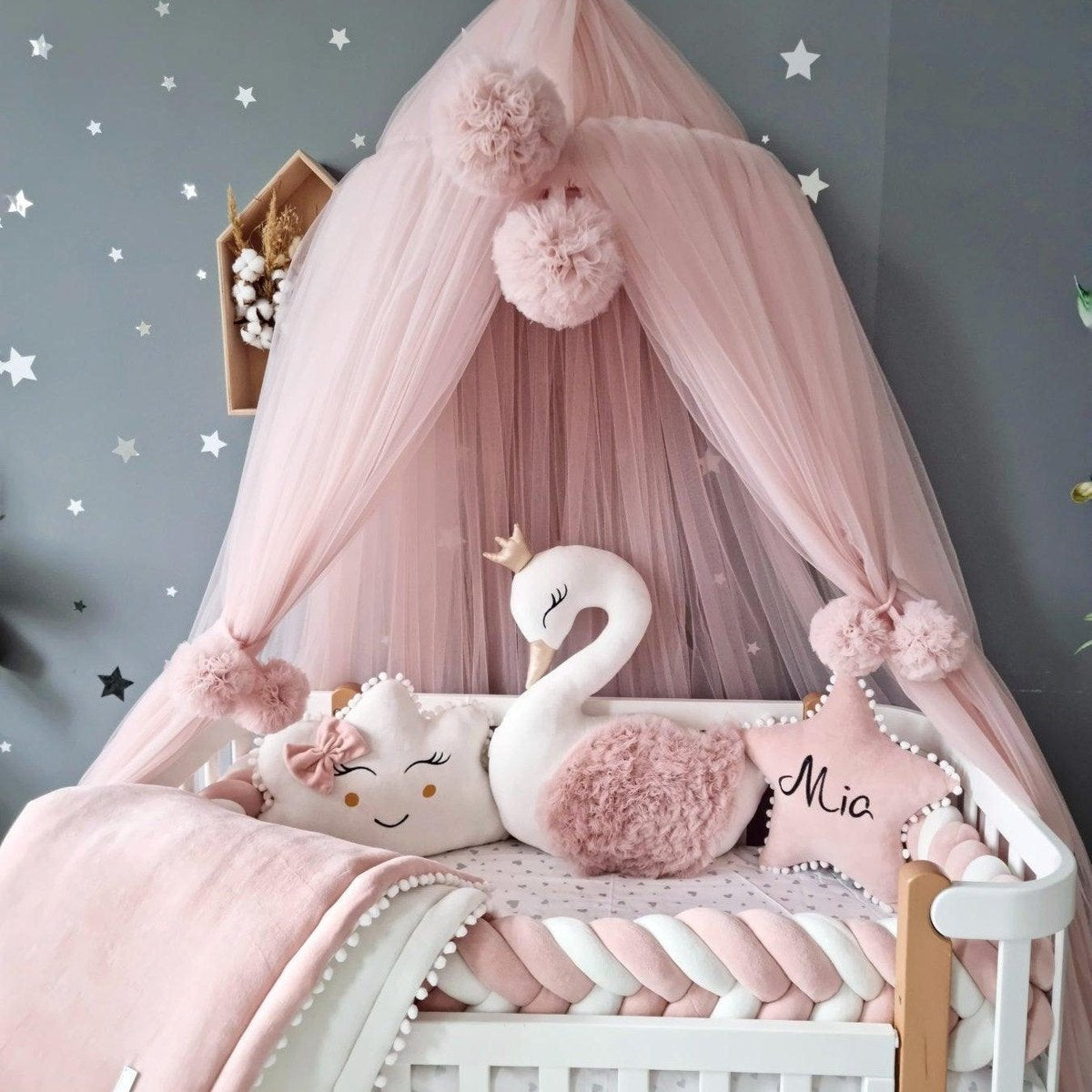
Die Gestaltung einer beruhigenden Kinderzimmerumgebung beginnt mit der Auswahl der richtigen Farbpalette. Sanfte Pastelltöne sind die perfekte Lösung, um Ruhe zu fördern. Entdecken Sie unsere Einblicke in die Kinderzimmergestaltung und verwandeln Sie den Raum Ihres Babys in einen ruhigen Rückzugsort.
Sanfte Pastellfarben bieten ein sanftes visuelles Erlebnis, das Säuglinge beruhigt und eine friedliche Atmosphäre schafft. Laut einer Studie des Palomar College können natürliche und gedämpfte Farben wie sanftes Blau , blasses Grün und zartes Rosa Ängste deutlich reduzieren und ein Gefühl der Stabilität fördern.
Berücksichtigen Sie bei der Auswahl von Pastellfarben für ein Kinderzimmer diese strategischen Ansätze:
-
Wählen Sie kühle und neutrale Töne , die einen beruhigenden Hintergrund bieten
-
Schichten Sie verschiedene Pastelltöne, um visuelle Tiefe zu erzeugen, ohne die Stimulation zu überfordern
Die psychologische Wirkung von Farben kann nicht unterschätzt werden. Eine in PubMed veröffentlichte Studie ergab, dass Kinder positiv auf sanfte, helle Farben reagieren. Pastelltöne eignen sich daher hervorragend für die Schaffung einer förderlichen Umgebung.
Zu den wichtigsten Pastellfarben, die Sie in Betracht ziehen sollten, gehören:
-
Sanftes Mintgrün : Steht für Wachstum und Erneuerung
-
Blasser Lavendel : Fördert Entspannung und Ruhe
-
Helles Pfirsich : Schafft eine warme, sanfte Atmosphäre
Durch die durchdachte Einbeziehung von Pastellfarben können Sie ein Kinderzimmer gestalten, das nicht nur schön aussieht, sondern auch das emotionale Wohlbefinden und die sensorische Entwicklung Ihres Babys unterstützt.
2: Erwägen Sie von der Natur inspirierte Farbtöne
Die Gestaltung eines Kinderzimmers mit naturinspirierten Farbtönen bringt die beruhigende Atmosphäre der Natur direkt in das Zimmer Ihres Babys. Entdecken Sie unsere Ressourcen zur Kinderzimmergestaltung und erfahren Sie, wie natürliche Farben das Zimmer Ihres Babys verwandeln können.
Von der Natur inspirierte Farben bieten mehr als nur einen ästhetischen Reiz. Wissenschaftlichen Untersuchungen zufolge kann die Einwirkung von Grün- und Grün-Weiß-Tönen Stress deutlich reduzieren und die körperliche Entspannung fördern.
Die Kraft natürlicher Farbpaletten liegt in ihrer Fähigkeit, eine ruhige und erdende Umgebung zu schaffen. Diese Farben imitieren die sanften Töne von Landschaften, Wäldern und Wiesen und bieten einen beruhigenden Hintergrund für die frühen Entwicklungsphasen Ihres Babys.
Zu den wichtigsten von der Natur inspirierten Farbstrategien gehören:
-
Erdtöne : Sanfte Brauntöne, gedämpfte Grüntöne und warme Terrakottatöne
-
Waldpalette : Salbeigrün, Moosgrün und sanfte Kieferntöne
Berücksichtigen Sie bei der Auswahl von von der Natur inspirierten Farben die folgenden Elemente:
-
Wählen Sie sanfte, gedämpfte Versionen natürlicher Farben, um eine Überreizung zu vermeiden
-
Schichten Sie verschiedene natürliche Farbtöne, um Tiefe und visuelles Interesse zu erzeugen
Farben wie Salbeigrün , warmes Beige und sanftes Steingrau verwandeln ein Kinderzimmer in einen ruhigen Rückzugsort, der eine Verbindung zur Natur vermittelt. Mit diesen Farbtönen schaffen Sie einen Raum, der das emotionale Wohlbefinden Ihres Babys fördert und ihm ein Gefühl von Ruhe und Geborgenheit vermittelt.
3: Verwenden Sie helle Akzente für Verspieltheit
Mit hellen Akzenten im Kinderzimmer schaffen Sie optische Akzente und schaffen gleichzeitig eine ruhige Atmosphäre. Entdecken Sie kreative Tipps für die Kinderzimmergestaltung, um Farbe und Anregung optimal in Einklang zu bringen.
Während Räume voller leuchtender Farben Kleinkinder überfordern können , kann die strategische Platzierung von Farben Freude wecken und die kognitive Entwicklung fördern. Laut einer Studie von PubMed spielen Farbinteraktionen eine entscheidende Rolle für die Sinneserfahrungen von Kindern.
Der Schlüssel liegt in Mäßigung und gezielter Platzierung . Helle Akzente sollten die Farbpalette des Kinderzimmers ergänzen, nicht dominieren. Diese Farbtupfer können die visuelle Neugier Ihres Babys wecken und die Sinne Ihres Babys anregen.
Beachten Sie diese Richtlinien zum Einfügen heller Akzente:
-
Verwenden Sie kleine dekorative Elemente wie Kissen, Kunstwerke oder einzelne Wandpaneele
-
Wählen Sie gesättigte, aber nicht überwältigende Farben wie sonniges Gelb, Koralle oder Türkis
Zu den intelligenten Strategien für Akzentfarben gehören:
-
Geometrische Wandtattoos in leuchtenden Farben
-
Bunte Bilderrahmen oder Regale
Durch die gezielte Verwendung heller Elemente schaffen Sie ein Kinderzimmer, das sowohl anregend als auch beruhigend wirkt. Ziel ist es, visuelles Interesse zu wecken, ohne eine Reizüberflutung zu verursachen und die sich entwickelnden Wahrnehmungsfähigkeiten und das emotionale Wohlbefinden Ihres Babys zu fördern.
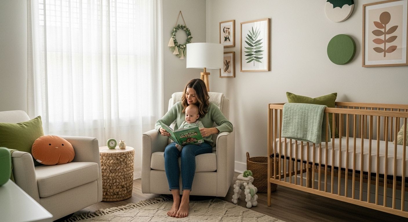
4: Entscheiden Sie sich für neutrale Farbtöne für Vielseitigkeit
Neutrale Farbtöne bieten eine intelligente Gestaltungsmöglichkeit für Ihr Kinderzimmer und bilden eine zeitlose Grundlage, die sich an das Wachstum Ihres Kindes anpasst. Entdecken Sie unseren Leitfaden zur minimalistischen Kinderzimmergestaltung und erfahren Sie, wie vielseitige Farben Ihren Raum verwandeln können.
Laut einer Studie des Palomar College schaffen neutrale Farben eine ruhige, beruhigende und konzentrierte Atmosphäre , die die emotionale und kognitive Entwicklung von Kindern unterstützt. Diese dezenten Töne reduzieren visuelle Störungen und fördern ein Gefühl der Stabilität.
Neutrale Farbtöne sind nicht nur schlicht. Sie stellen eine raffinierte Palette dar, die bemerkenswerte Flexibilität für zukünftige Raumumgestaltungen bietet. Warme Beige-, sanfte Grau- und Cremeweißtöne können als eleganter Hintergrund für das Kinderzimmer Ihres Babys dienen und ermöglichen gleichzeitig einfache Stilanpassungen, wenn sich die Persönlichkeit Ihres Kindes entwickelt.
Berücksichtigen Sie diese Strategien zur Implementierung neutraler Farben:
-
Wählen Sie warme Untertöne , die eine einladende Umgebung schaffen
-
Wählen Sie hochwertige Farbe mit subtiler Tiefe und Variation
Zu den wichtigsten Vorteilen neutraler Farben gehören:
-
Einfach mit farbenfrohen Dekorelementen zu ergänzen
-
Zeitlose Ästhetik , die mit Ihrem Kind mitwächst
Durch die Wahl neutraler Farbtöne schaffen Sie eine ruhige Leinwand, die Sie durch Accessoires, Kunstwerke und Textilien individuell gestalten können. So bleibt Ihr Kinderzimmer anpassungsfähig, anspruchsvoll und bietet Ihrem Kind in den ersten Lebensjahren emotionale Unterstützung.
5: Integrieren Sie geschlechtsneutrale Farben
Geschlechtsneutrale Kinderzimmergestaltung geht über traditionelle Farbstereotypen hinaus und bietet einen fortschrittlichen Ansatz zur Schaffung inklusiver und anpassungsfähiger Räume. Entdecken Sie unsere geschlechtsneutralen Designtipps, um das Zimmer Ihres Babys neu zu gestalten.
Einer Studie im British Journal of Psychology zufolge können Farb-Geschlechts-Assoziationen unbewusst schädliche Stereotypen aktivieren und verewigen. Geschlechtsneutrale Farben bieten die Möglichkeit, diese tief verwurzelten Wahrnehmungen zu hinterfragen und ein offeneres Umfeld für Ihr Kind zu schaffen.
Neutrale Farbpaletten überwinden die traditionellen Grenzen von Rosa und Blau und schaffen anspruchsvolle und einladende Räume , die individuelles Potenzial fördern, anstatt vorgefasste Erwartungen zu erfüllen. Farben wie Salbeigrün, sanftes Senfgelb, warmes Grau und gedämpftes Terrakotta können eine reiche, integrative Atmosphäre schaffen, die die einzigartige Persönlichkeit Ihres Kindes unterstützt.
Berücksichtigen Sie diese Strategien zur Implementierung geschlechtsneutraler Farben:
-
Wählen Sie erdige und natürliche Töne , die warm und einladend wirken
-
Mischen Sie Texturen und Schattierungen, um Tiefe und Interesse zu erzeugen
Zu den wichtigsten Grundsätzen der geschlechtsneutralen Farbauswahl gehören:
-
Vermeidung strenger Farbstereotypen
-
Emotionaler Komfort hat Vorrang vor traditionellen Erwartungen
Indem Sie Farben wählen, die weder zu maskulin noch zu feminin sind, schaffen Sie ein Kinderzimmer, das die individuelle Identität Ihres Kindes begrüßt und feiert. Dieser Ansatz unterstützt die emotionale Entwicklung und bietet eine flexible Grundlage für das wachsende Selbstbewusstsein Ihres Babys.
6: Experimentieren Sie mit Farbkombinationen
Farbkombinationen verwandeln das Kinderzimmerdesign von banal in magisch und schaffen visuelle Symphonien, die beruhigen und anregen. Entdecken Sie unsere Farbkoordinationstechniken, um die Ästhetik Ihres Kinderzimmers zu verbessern.
Einer in PubMed veröffentlichten Studie zufolge können bestimmte Farbkombinationen vorhersehbare emotionale Reaktionen hervorrufen. Durchdachte Farbkombinationen können die Atmosphäre im Zimmer Ihres Babys maßgeblich beeinflussen und so das emotionale Wohlbefinden und die sensorische Entwicklung fördern.
Erfolgreiche Farbkombinationen erfordern ein Verständnis der Farbbeziehungen und der psychologischen Wirkung. Komplementäre und analoge Farbschemata bieten anspruchsvolle Ansätze zur Gestaltung harmonischer Kinderzimmerumgebungen.
Erwägen Sie diese strategischen Farbkombinationstechniken:
-
Monochromatische Schichten mit verschiedenen Schattierungen einer Farbe
-
Komplementäre Farbpaarungen mit sanften, gedämpften Intensitäten
Zu den wichtigsten Grundsätzen für effektive Farbkombinationen gehören:
-
Gleichen Sie visuelles Interesse mit emotionaler Ruhe aus
-
Beschränken Sie Ihre Palette auf maximal 3-4 Farben
Experimentieren ist entscheidend. Sanftes Salbeigrün mit warmem Creme, blasses Lavendel mit Hellgrau oder gedämpftes Terrakotta mit sanftem Weiß schaffen nuancierte, elegante Räume, die mit Ihrem Kind mitwachsen. Wenn Sie die Wechselwirkungen von Farben verstehen, gestalten Sie ein Kinderzimmer, das sowohl optisch ansprechend als auch emotional unterstützend ist.
7: Denken Sie an Licht- und Farbeffekte
Die Beleuchtung spielt eine entscheidende Rolle bei der Gestaltung der Farbpalette im Kinderzimmer und beeinflusst Stimmung, Wahrnehmung und emotionales Wohlbefinden. Entdecken Sie unsere Einblicke in die Kinderzimmergestaltung, um die perfekt beleuchtete Umgebung zu schaffen.
Wissenschaftlichen Untersuchungen zufolge kann die Farbtemperatur des Lichts physiologische und kognitive Reaktionen erheblich beeinflussen. Sanftes, warmes Licht kann die wahrgenommene Wärme der Farben verstärken und so eine einladendere und beruhigendere Atmosphäre im Kinderzimmer schaffen.
Es ist wichtig zu verstehen, wie verschiedene Lichtquellen mit Farben interagieren. Natürliches Tageslicht , warmweiße LED-Lampen und dimmbare Beleuchtungsoptionen können das Aussehen und die emotionale Wirkung der von Ihnen gewählten Farbpalette dramatisch verändern.
Berücksichtigen Sie die folgenden Strategien zur Interaktion zwischen Beleuchtung und Farbe:
-
Verwenden Sie warm getönte Glühbirnen , um kühle Farbpaletten abzumildern
-
Mehrschichtige Beleuchtung mit mehreren Lichtquellen für mehr Vielseitigkeit
Zu den wichtigsten Grundsätzen für die Steuerung von Lichteffekten gehören:
-
Vermeiden Sie grelles, direktes Licht
-
Schaffen Sie Tiefe durch strategische Lichtplatzierung
Durch die durchdachte Kombination von Beleuchtungstechniken mit Ihrer Farbauswahl können Sie ein Kinderzimmer schaffen, das dynamisch und beruhigend wirkt und auf die wechselnden Bedürfnisse Ihres Babys eingeht.
Nachfolgend finden Sie eine umfassende Tabelle mit einer Zusammenfassung der wichtigsten Farbideen für Kinderzimmer, praktischer Strategien und Vorteile, die im Artikel zur Schaffung eines beruhigenden und anpassungsfähigen Raums erörtert werden.
| Farbidee fürs Kinderzimmer | Beschreibung & Strategien | Vorteile für Baby & Weltraum |
|---|---|---|
| Sanfte Pastelltöne für Gelassenheit | Verwenden Sie blasse Farbtöne wie Mintgrün, Lavendel und helles Pfirsich; schichten Sie kühle, neutrale Töne übereinander, um eine optische Ruhe zu erzielen. | Fördert Ruhe, emotionale Stabilität und eine beruhigende Atmosphäre. |
| Von der Natur inspirierte Farbtöne | Integrieren Sie Salbeigrün, Erdtöne und gedämpfte Naturtöne; schichten Sie für Tiefe und eine Verbindung zur Natur. | Reduziert Stress, sorgt für Ruhe im Kinderzimmer und fördert die Entspannung. |
| Helle Akzente für Verspieltheit | Fügen Sie gesättigte Farben durch kleine Dekorationen (Kissen, Wandaufkleber, Kunstwerke) hinzu; verwenden Sie Akzente, ohne zu überladen. | Stimuliert die Neugier und die kognitive Entwicklung und vermeidet gleichzeitig eine Reizüberflutung. |
| Neutrale Farbtöne für Vielseitigkeit | Wählen Sie warme Beigetöne, sanfte Grautöne und cremige Weißtöne; nutzen Sie diese als flexible Hintergründe für sich entwickelnde Stile. | Bietet zeitloses, anpassungsfähiges Design, während Ihr Kind wächst, und reduziert visuelle Störungen. |
| Geschlechtsneutrale Farben | Verwenden Sie Erdtöne und vermeiden Sie traditionelle Farbstereotypen; mischen Sie Texturen, um ein interessantes Ergebnis zu erzielen. | Fördert Inklusivität und Individualität und unterstützt gleichzeitig emotionalen Komfort. |
| Durchdachte Farbkombinationen | Schaffen Sie Harmonie mit monochromen oder komplementären Paletten; beschränken Sie sich für ein ausgewogenes Verhältnis auf 3–4 Farben. | Ruft positive Emotionen hervor und schafft visuelle Harmonie. |
| Licht- und Farbeffekte | Verwenden Sie warme Glühbirnen, natürliches Licht und mehrschichtige Beleuchtung, um die Farbwirkung zu verstärken; vermeiden Sie grelles Licht. | Verbessert die Stimmung, Wahrnehmung und das allgemeine Ambiente im Kinderzimmer. |
Erwecken Sie beruhigende Farbideen mit Kari Studio Essentials zum Leben
Sie haben entdeckt, wie sanfte Pastelltöne, naturinspirierte Töne und leuchtende Akzente eine friedliche Kinderzimmeratmosphäre schaffen können. Doch um einen wirklich beruhigenden Raum zu schaffen, braucht es mehr als nur die richtige Farbe. Jedes Detail, vom Babybettzubehör bis zum kuscheligen Kissen, trägt dazu bei, die schöne Farbtheorie in eine behagliche, realistische Umgebung zu verwandeln, die Ihr Baby lieben wird. Entdecken Sie exklusive Angebote in unserem Sale für geflochtene Bettumrandungen und Babybettwäsche – bis zu 20 % Rabatt – und erleben Sie, wie ausgewählte Kinderzimmerdetails Ihre gewählte Farbpalette sofort aufwerten.

Bereit, Inspiration in die Tat umzusetzen? Kaufen Sie sichere, stilvolle Essentials wie handgefertigte Knotenkissen und weiche Kinderbettwäsche passend zu Ihren Farbwünschen. Besuchen Sie Kari Studio noch heute und schaffen Sie das beruhigende Kinderzimmer, das Ihre Familie verdient – solange unsere besten Angebote gültig sind.
Häufig gestellte Fragen
Welche Farben eignen sich am besten für die Gestaltung eines beruhigenden Kinderzimmers?
Sanfte Pastellfarben wie Hellblau, Blassgrün und Zartrosa eignen sich hervorragend, um in einem Kinderzimmer Ruhe und eine heitere Atmosphäre zu schaffen.
Wie kann ich im Zimmer meines Babys von der Natur inspirierte Farben verwenden?
Integrieren Sie Erdtöne wie sanftes Braun, gedämpftes Grün und warme Terrakottatöne, um die beruhigende Atmosphäre der Natur nachzuahmen und eine wohltuende Kulisse für das Zimmer Ihres Babys zu schaffen.
Wie lassen sich wirkungsvolle Akzente setzen, ohne das Kinderzimmer zu überladen?
Verwenden Sie kleine dekorative Elemente wie Kissen, Kunstwerke oder geometrische Wandaufkleber, um in Maßen leuchtende Farben einzuführen und sicherzustellen, dass sie die insgesamt beruhigende Farbpalette ergänzen.
Warum sollte ich geschlechtsneutrale Farben für ein Kinderzimmer in Betracht ziehen?
Geschlechtsneutrale Farben helfen dabei, traditionelle Farbstereotypen herauszufordern und einen integrativeren und anpassungsfähigeren Raum zu schaffen, der die einzigartige Persönlichkeit Ihres Kindes unterstützt, ohne vorgefasste Erwartungen aufzuerlegen.
Empfohlen
- 10 Deko-Ideen für ein gemütliches Babyzimmer
- 7 wichtige Tipps für die minimalistische Gestaltung eines Kinderzimmers
- Trends bei geflochtenen Bettumrandungen
- 8 inspirierende DIY-Dekorationsideen für das Kinderzimmer Ihres Babys
- 7 zeitlose Farbschemata für die Küche Ihres Zuhauses
- Wie Unternehmer farbiges Licht nutzen können, um produktiv zu bleiben